User interface mockups: Difference between revisions
Mr. MacKenty (talk | contribs) No edit summary |
Mr. MacKenty (talk | contribs) |
||
| Line 8: | Line 8: | ||
<br/> | <br/> | ||
[[File:ExampleUImockup2.png|400px]] | [[File:ExampleUImockup2.png|400px]] | ||
== Do you understand this? == | == Do you understand this? == | ||
Revision as of 09:23, 30 January 2018

Web Science[1]
In manufacturing and design, a mockup, or mock-up, is a scale or full-size model of a design or device, used for teaching, demonstration, design evaluation, promotion, and other purposes. A mockup is a prototype if it provides at least part of the functionality of a system and enables testing of a design. Mock-ups are used by designers mainly to acquire feedback from users. Mock-ups address the idea captured in a popular engineering one-liner: You can fix it now on the drafting board with an eraser or you can fix it later on the construction site with a sledge hammer.[2]
Example UI[edit]
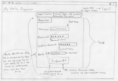
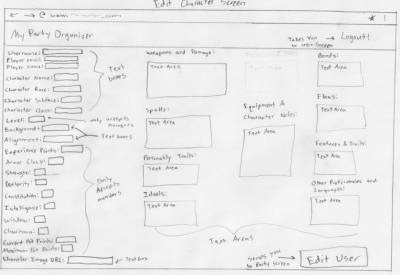
I am grateful to my student Cameron, a 9th grader in my designing solutions through programming for the following two ui mockups:


Do you understand this?[edit]
Standards[edit]
- This topic doesn't cover a specific standard, but it is something you should you know.